pacman::p_load(DT,plotly,tidyverse,patchwork,ggiraph,ggstatsplot, performance)Take Home Ex 3
Overview
1 Getting Started
Installing and loading packages
2 The Dataset
The code chunk below imports the dataset into R by using read_csv() of readr and save it as an tibble data frame called data
data<- read_csv("resale-flat-prices-based-on-registration-date-from-jan-2017-onwards.csv")head(data)# A tibble: 6 × 11
month town flat_…¹ block stree…² store…³ floor…⁴ flat_…⁵ lease…⁶ remai…⁷
<chr> <chr> <chr> <chr> <chr> <chr> <dbl> <chr> <dbl> <chr>
1 2017-01 ANG MO … 2 ROOM 406 ANG MO… 10 TO … 44 Improv… 1979 61 yea…
2 2017-01 ANG MO … 3 ROOM 108 ANG MO… 01 TO … 67 New Ge… 1978 60 yea…
3 2017-01 ANG MO … 3 ROOM 602 ANG MO… 01 TO … 67 New Ge… 1980 62 yea…
4 2017-01 ANG MO … 3 ROOM 465 ANG MO… 04 TO … 68 New Ge… 1980 62 yea…
5 2017-01 ANG MO … 3 ROOM 601 ANG MO… 01 TO … 67 New Ge… 1980 62 yea…
6 2017-01 ANG MO … 3 ROOM 150 ANG MO… 01 TO … 68 New Ge… 1981 63 yea…
# … with 1 more variable: resale_price <dbl>, and abbreviated variable names
# ¹flat_type, ²street_name, ³storey_range, ⁴floor_area_sqm, ⁵flat_model,
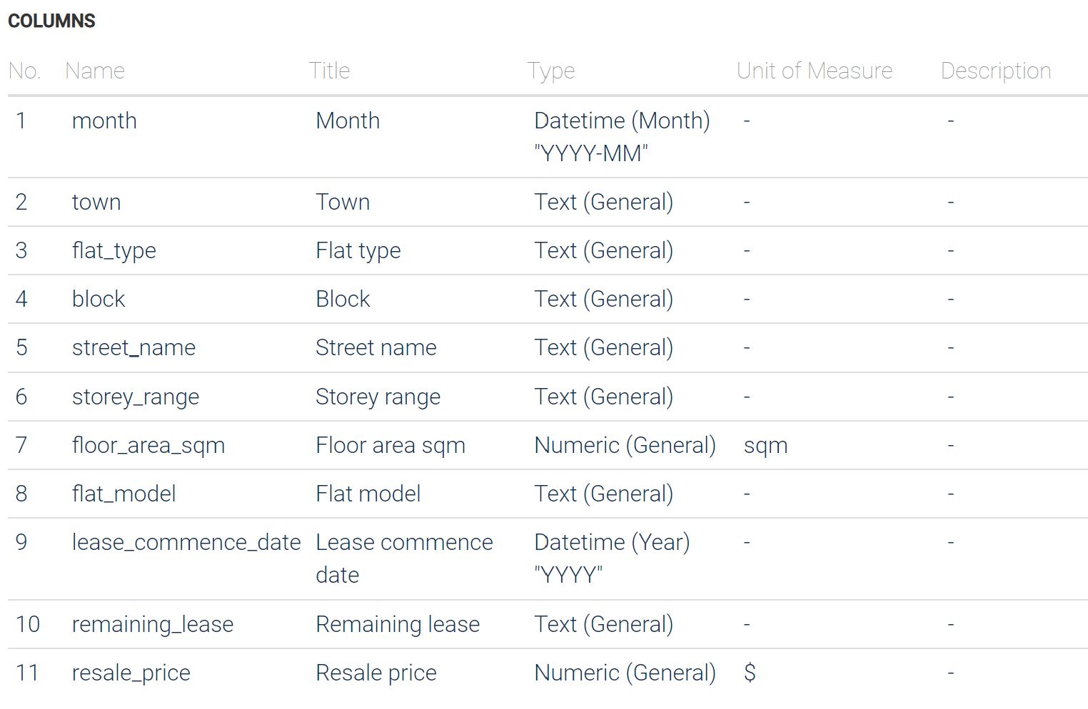
# ⁶lease_commence_date, ⁷remaining_leaseBelow is a screenshot of the official website to give a clear view of the column meaning.
3 Data Cleaning
Since we only need the data in 2022 and the record of 3/4/5 room units, we need to filter the data.
data <-filter(data,month %in% c("2022-01","2022-02","2022-03","2022-04","2022-05","2022-06","2022-07","2022-08","2022-09","2022-10","2022-11","2022-12"))data <-filter(data,flat_type %in% c("3 ROOM","4 ROOM","5 ROOM")) %>%
mutate("resale_price(KSGD)"=resale_price/1000)4 Visualization
4.1 The Distribution of Resale Price
ks.test(data$'resale_price(KSGD)',"pnorm")
    Asymptotic one-sample Kolmogorov-Smirnov test

data:  data$"resale_price(KSGD)"
D = 1, p-value < 2.2e-16
alternative hypothesis: two-sided
A p-value less than the significance level (0.05) indicates that the null hypothesis (that the sample data comes from a normal distribution) should be rejected.
gghistostats(
  data = data,
  x = 'resale_price(KSGD)',
  binwidth = 25,
  type="robust",
  test.value = 500,
  xlab = "Resale Price",
  title="The distribution of Resale price (2022,3/4/5 Room-unit)",
  centrality.line.args = list(color = "#D55E30", linetype = "dashed"),
  )+
  ggthemes::theme_fivethirtyeight()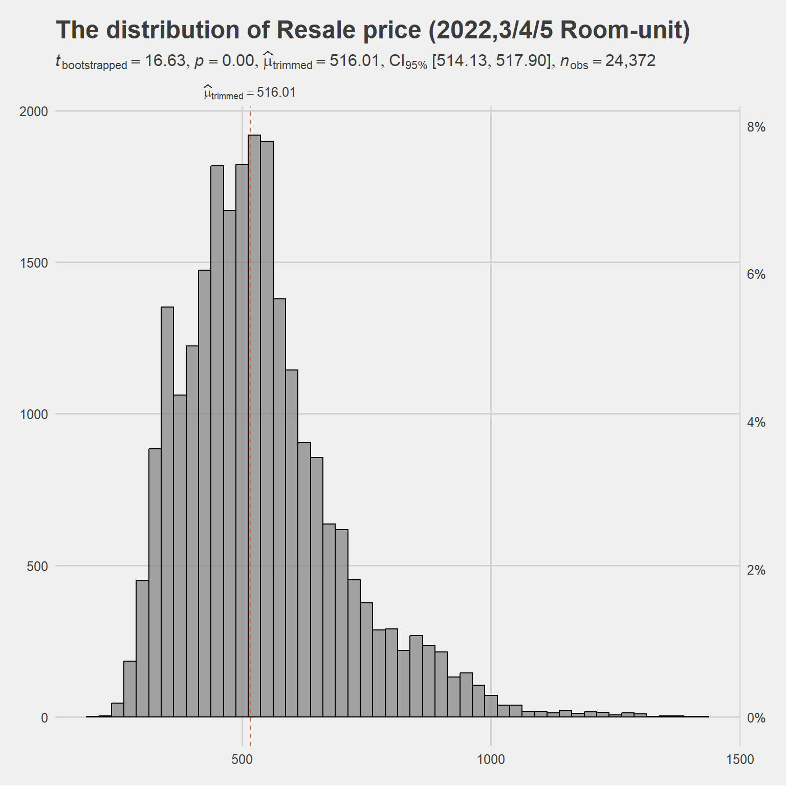
The skewness of the data distribution is high, with 95% confidence that the trimmed mean is 516.01 KSGD.
4.2 Line Graph of the Resale Price Trend in 2022
data1=data %>% group_by(flat_type,month) %>%
         summarise(mean_resale_price_per_month = mean(resale_price),
.groups = 'drop')p<- plot_ly(data = data1,
x = ~month,
y = ~mean_resale_price_per_month,
color = ~flat_type ,
colors = "Set1",
title='Line graph of the resale price trend in 2022 ')
add_trace(p, type = "scatter",
mode = "markers+lines")In this graph, users can observe the resale price trend of 3 room, 4 room, 5 room unit seperatly in 2022.Each plot means the average price of that kind of unit for the single month, by hovering the mouse, user can view the specific data. Overall all three room types are increasing in price, but the three bedrooms are increasing in price to a lesser extent than the other two.
4.3 Violin Boxplot of the Resale Price in 2022
ggbetweenstats(
  data=data,
  x='flat_type',
  y='resale_price(KSGD)',
  plot.type = "boxviolin",
  outlier.tagging = TRUE, ## whether outliers should be flagged
  outlier.coef = 1.5, ## coefficient for Tukey's rule
  outlier.label = 'town',
  outlier.label.args = list(color = "red",size=2),
  package = "ggsci",
  palette = "nrc_npg",
  xlab = "Flat Type",
  ylab='Resale Price (KSGD)',
  title = "violin boxplot of the resale price in 2022 (3/4/5 room unit)",

  )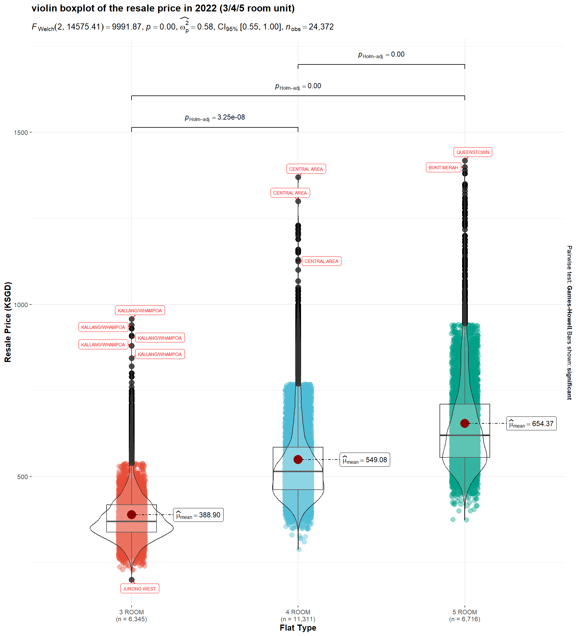
This chart shows the distribution of prices for each of the three room types, with a greater concentration of prices for the 3 room style. The other two have a more skewed distribution and the 4 room style has the highest number and more outlier. The outliers in the graph are marked with a town label.
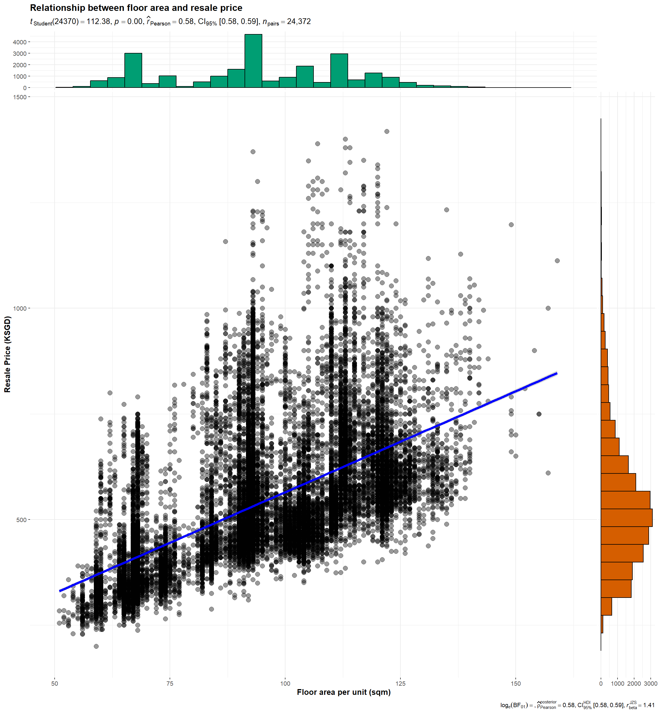
4.4 Relationship between Floor Area and Resale Price
ggscatterstats(
  data = data,
  x = 'floor_area_sqm',
  y = 'resale_price(KSGD)',
  xlab = " Floor area per unit (sqm)",
  ylab = "Resale Price (KSGD)",
  label.var = 'town',
  label.expression = x < 100 & y > 1000,
  point.label.args = list(alpha = 0.7, size = 3, color = "grey50"),
  xfill = "#EBD3E8",
  yfill = "#C4E1E1",
  title = "Relationship between floor area and resale price",

)
plot_ly(data = data,
  x = ~floor_area_sqm,
  y = ~resale_price,
  text = ~paste( "<br>Town:", town),
  color = ~flat_type,
  colors = "Set2")
The two diagrams above show the relationship between floor area and resale price, with the different colours indicating the different flat types. And by hovering the mouse, user can know which town an exact unit is in.
plot_ly(data = data,
  x = ~flat_model,
  y = ~resale_price,
  color = ~flat_type,
  colors = "Set2")