pacman::p_load(tidyverse)Hands-Ex01
Getting Started
Importing the data
#| eval: false
exam_data <- read_csv("data/Exam_data.csv")
Plotting a bar chart
ggplot(data=exam_data,
       aes(x=RACE))+
geom_bar()hist(exam_data$MATHS)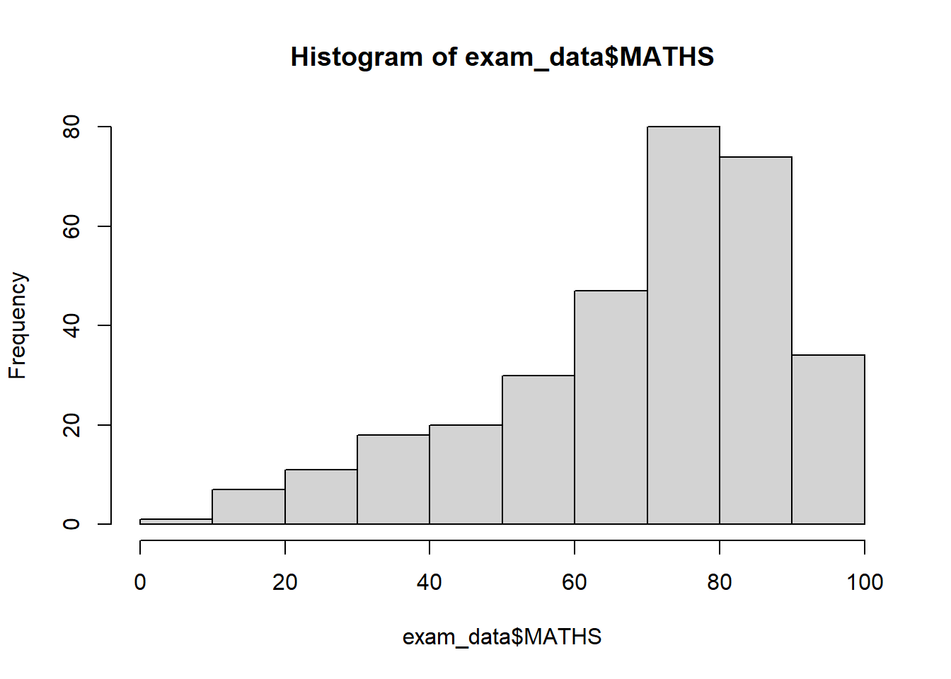
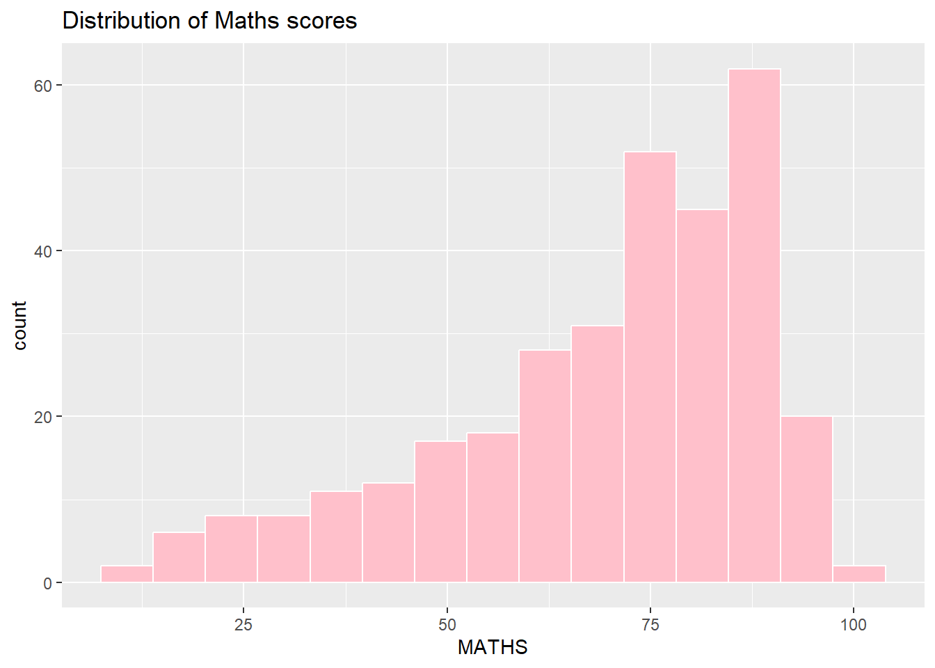
ggplot(data=exam_data, aes(x = MATHS)) +
  geom_histogram(bins=15,
                 boundary = 1,
                 color="white",
                 fill="pink") +
  ggtitle("Distribution of Maths scores")